Town Apply For Planning Permission For Sir Alf Stand Signage
Tuesday, 1st Aug 2023 09:25 Town have applied for planning permission to install new signage on the back of the Sir Alf Ramsey Stand.
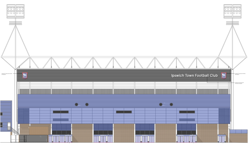
The view of the back of the stand has been opened up with the demolition of the old Office Outlet (previously Staples) and Better Gym building over the summer.
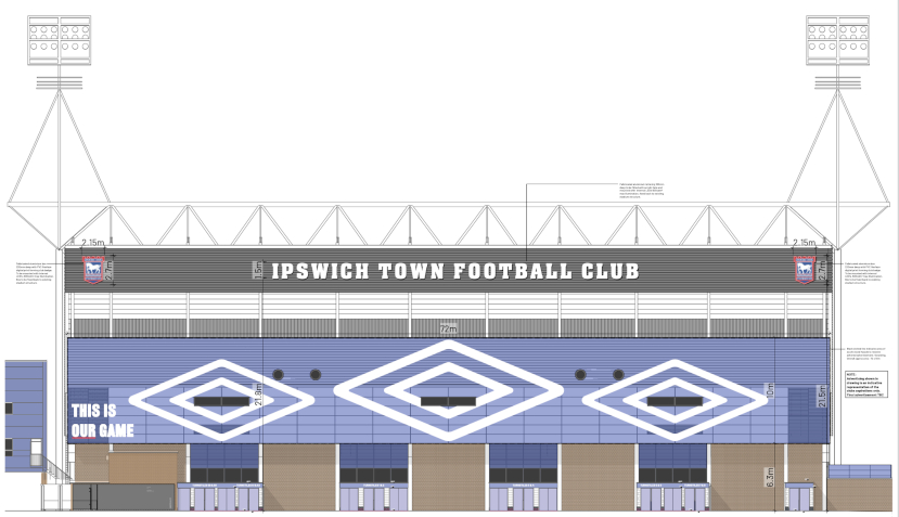
The new application includes internally illuminated as well as non-illuminated signs bearing the name of the club as well as the logo of kit manufacturer Umbro.
Current signage
New signage
Photos: Matchday Images/ITFC
Please report offensive, libellous or inappropriate posts by using the links provided.
MickMillsTash added 09:36 - Aug 1
My opinion is that the world needs less things lit up, creating light pollution and wasting energy but I guess it makes sense. |  | |
statto72 added 09:50 - Aug 1
While they’re at it, can they do something about the SAR stand signage that’s inside the stadium? It looks awful and was clearly done on the cheap during the Evans era. |  | |
Suffolk_n_Proud added 09:53 - Aug 1
I like the club name centre and will probably look really nice lit up. The Umbro signage looks too much though |  | |
Gilesy added 09:56 - Aug 1
I rather like it as it is - classy and understated. I guess the new font is a nod towards the lettering on the Cobbold Stand, which is nice, but I still prefer it as it is. | | |
ArnieM added 10:11 - Aug 1
It’s quite striking actually.
Does this mean we are connected to Umbro for the foreseeable future then? |  | |
Essen_blue added 10:14 - Aug 1
I would like one huge screen across the whole stand or maybe just coloured lights like the allianz. | | |
SamWhiteUK added 10:17 - Aug 1
They better get the right font.
Oh, and that Umbro logo looks pretty terrible. |  | |
Bluearmy_81 added 10:17 - Aug 1
I’m assuming Umbro are paying us handsomely for this? | | |
Bluearmy_81 added 10:18 - Aug 1
One Umbro sign in the middle would be ok. Three seems too much to me | | |
AlanG296 added 10:21 - Aug 1
Freshening up the facade with consistent colour and graphic is great. Then plastering it with a massive advert for a here today gone tomorrow kit supplier dominating the view on approach is tacky, classless and completely unnecessary. Do we really need their money that much? We're better than that. | | |
Marcus added 10:23 - Aug 1
Lit up may be a good image, but more light pollution isn't a good thing. Would hope they would use a light reflective system and solar panels at least. I can see what the plan is - it would make the club a very visible landmark when arriving from the railway station direction. Just think it may not have that much longevity as a design beyond the initial impression. |  | |
Naylorsrightboot added 10:24 - Aug 1
The name looks great across the top. The umbro signage is way over the top. Looks really silly actually. One umbro sign would have done. Who designs these things?! |  | |
Europa added 10:29 - Aug 1
That window line passing horizontally through through the centre of the Umbro logo is rather unfortunate. While the resulting symbol (diamond with a line through it) doesn't mean anything to a Brit, when ITFC make it back into Europe, many Europeans coming to Portman Road will find three female, erm, "bits" hilarious. | | |
BobbyBell added 10:29 - Aug 1
The way our club is run today I suspect that allowing Umbro such large and prominent signage means that we have struck a deal which is of great value to the club. I trust the people running our club these days as they have already proved to be very shrewd and savvy. | | |
ArchiRob added 10:41 - Aug 1
UMBRO overthe top for me the 3 logos lacks balance.
Central Town sign good
|  | |
Rimsy added 10:44 - Aug 1
Love the signage. It'll look imposing to the away fans making their way from the station. Umbro is a bit overdone, just the central one would have sufficed. |  | |
joyousblue added 11:06 - Aug 1
You have never had it so good yet moan moan moan | | |
cookra added 11:14 - Aug 1
Excellent idea.
Low energy lighting just enough to illuminate it all , perfect !
Bringing an old stand / stadium up to the modern world these last few years and its great to see
Well done MArk Ashton once again |  | |
gorfuc added 11:19 - Aug 1
Is that Umbro Arena I see coming down the road? |  | |
Les57 added 11:28 - Aug 1
I’d much prefer an upgrade to the PA system in the cobbold stand so we could actually understand anything being said. | | |
December1963 added 11:33 - Aug 1
After years of under investment Gamechanger are bringing our stadium and club into the 21st century and what do we get moan moan moan. | | |
December1963 added 11:33 - Aug 1
After years of under investment Gamechanger are bringing our stadium and club into the 21st century and what do we get moan moan moan. | | |
Gilesy added 11:38 - Aug 1
No one has to love everything that comes our way! | | |
dirtydingusmagee added 11:39 - Aug 1
gorfuc, it might be the Triple Umbro Stadium ,home of the ''Pride of East Anglia''. COYB |  | |
Lukeybluey added 12:05 - Aug 1
I like it, looks professional. You go past other clubs like West Ham and they have things like this everywhere. | | |
You need to login in order to post your comments
|
Blogs 295 bloggersIpswich Town Polls |