| Had a go at redesigning the club badge on 17:26 - May 14 with 3447 views | Steve_M |
Interesting. I seem to remember that Arsenal changed their badge so they could copyright the design.
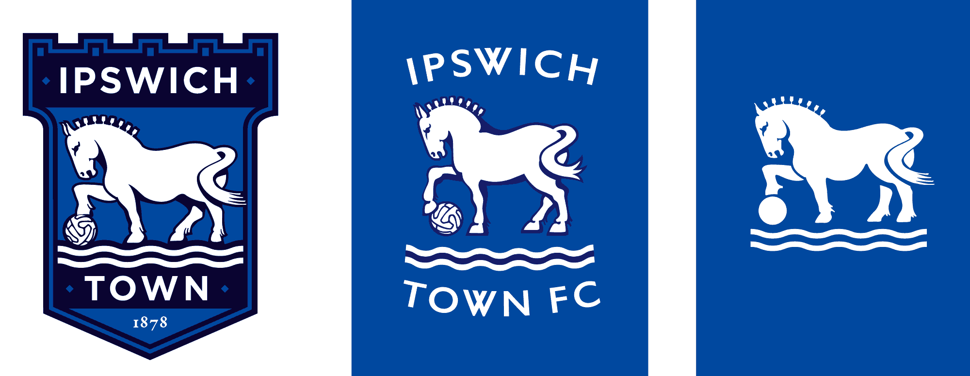
Of your new ITFC designed, I prefer the one where the shield has no coloured border, bottom left. Just looks a bit cleaner than those with a border. Not totally convinced of any need to change just yet either.
 |  |
|  |
| Had a go at redesigning the club badge on 17:43 - May 14 with 3329 views | RamseyRobson |
Any idea why the water direction (up to down) changed in the 1990's? (down to up)
Think i prefer the original incarnation |  | | |
| Had a go at redesigning the club badge on 17:48 - May 14 with 3296 views | mojo |
Really interesting post Bugblatter. I am not keen on the W. A bit too similar to Volkswagen for me but otherwise a really good effort and a most enjoyable read. |  | | |
| Had a go at redesigning the club badge on 18:12 - May 14 with 3215 views | slaughteredskipper |
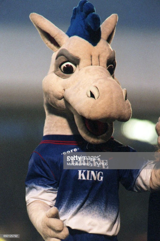
I actually really like your redesign in particular the more fierce Suffolk punch - I like the idea of a team with a bit of bite and think we’ve projected too soft an image for a while. Time to project a fiercer, more ambitious image and this could well be helped through the club badge. |  | | |
| Had a go at redesigning the club badge on 18:16 - May 14 with 3189 views | RonFearonsHair |
| Had a go at redesigning the club badge on 18:12 - May 14 by slaughteredskipper |
I actually really like your redesign in particular the more fierce Suffolk punch - I like the idea of a team with a bit of bite and think we’ve projected too soft an image for a while. Time to project a fiercer, more ambitious image and this could well be helped through the club badge. |
Time to find ferocious Bluey again?
 |  | | |
| Had a go at redesigning the club badge on 18:16 - May 14 with 3188 views | Swansea_Blue |
Not doing it for me, sorry.
The shadow is too MS Word, you've spelt ITFC wrong and it's not even the right colour.
 |  |
| |
| Had a go at redesigning the club badge on 18:23 - May 14 with 3161 views | BlueBertie |
These two are good....

 | | | |
Login to get fewer ads
| Had a go at redesigning the club badge on 18:32 - May 14 with 3111 views | BlueBertie |
| Had a go at redesigning the club badge on 18:16 - May 14 by Swansea_Blue |
Not doing it for me, sorry.
The shadow is too MS Word, you've spelt ITFC wrong and it's not even the right colour.
|
Just a bit of fun he said? 🤦â€â™‚ï¸ | | | |
| Had a go at redesigning the club badge on 18:37 - May 14 with 3087 views | Wacko |
Top middle is by far the best for me! | |
| |
| Had a go at redesigning the club badge on 18:41 - May 14 with 3073 views | Swansea_Blue |
| Had a go at redesigning the club badge on 18:32 - May 14 by BlueBertie |
Just a bit of fun he said? 🤦â€â™‚ï¸ |
I think that went a bit over your head!
Thet are very good indeed, but the first logo you see when you click on the thread is the one I was referring too. Obviously I realise that wasn't what the OP designed. Apologies ot the OP if he thought I was being serious. [Post edited 14 May 2021 18:44]
| |
| |
| Had a go at redesigning the club badge on 18:43 - May 14 with 3063 views | PositivelyPortman |
| Had a go at redesigning the club badge on 18:23 - May 14 by BlueBertie |
These two are good....
|
I much prefer the bottom one of these two.
The only alteration I’d make would make the ‘established 1878’ in white out of the blue. |  |
| |
| Had a go at redesigning the club badge on 18:44 - May 14 with 3063 views | BlueBertie |
| Had a go at redesigning the club badge on 18:37 - May 14 by Wacko |
Top middle is by far the best for me! |
https://imgur.com/a/kI30KuS [Post edited 14 May 2021 18:47]
| | | |
| Had a go at redesigning the club badge on 18:53 - May 14 with 3013 views | strikalite |
Needs redesigning imo with a slightly more athletic looking Suffolk Punch yes, the younger generation will thank us, if you put the ferrari prancing horse next to our carthorse, which one would they choose?
It's dated.. |  | | |
| Had a go at redesigning the club badge on 19:22 - May 14 with 2937 views | BlueBertie |
| Had a go at redesigning the club badge on 18:41 - May 14 by Swansea_Blue |
I think that went a bit over your head!
Thet are very good indeed, but the first logo you see when you click on the thread is the one I was referring too. Obviously I realise that wasn't what the OP designed. Apologies ot the OP if he thought I was being serious. [Post edited 14 May 2021 18:44]
|
Sorry it's been a long day. 🤪 | | | |
| Had a go at redesigning the club badge on 19:32 - May 14 with 2915 views | dickie |
Interesting exercise, but I still prefer the old yellow badge. I do quite like your design with no shield at all though (radical maaann!) | | | |
| Had a go at redesigning the club badge on 20:18 - May 14 with 2820 views | bugblatter |
| Had a go at redesigning the club badge on 18:16 - May 14 by RonFearonsHair |
Time to find ferocious Bluey again?
|
I loved that old Bluey. I really do often wonder what happened to him. He must be somewhere. They wouldn’t have skipped him surely?!
AN INVESTIGATION MUST BE ARRANGED.
Shall I start a crowd-funder? |  | | |
| Had a go at redesigning the club badge on 20:19 - May 14 with 2812 views | bugblatter |
| Had a go at redesigning the club badge on 20:18 - May 14 by bugblatter |
I loved that old Bluey. I really do often wonder what happened to him. He must be somewhere. They wouldn’t have skipped him surely?!
AN INVESTIGATION MUST BE ARRANGED.
Shall I start a crowd-funder? |
Bit odd that he didn’t have hooves though… | | | |
| Had a go at redesigning the club badge on 20:40 - May 14 with 2726 views | giant_stow |
| Had a go at redesigning the club badge on 18:16 - May 14 by Swansea_Blue |
Not doing it for me, sorry.
The shadow is too MS Word, you've spelt ITFC wrong and it's not even the right colour.
|
There no harsher critique to a designer than mentinni g ms word, you absolute rotter!
Op, I like your addition of the darker blue next to the lighter one. And your pissed off horse. Grr! |  |
| |
| Had a go at redesigning the club badge on 20:48 - May 14 with 2698 views | Darth_Koont |
Font-tastic!
Love a bit of fancy font-work. And I really like the “mashed” Ws.
I think it’s a tough job too. The horse, ball and waves are strange elements – and aren’t massively associated with the ITFC brand by anyone other than us who can see the connection back to teams wearing a similar badge in the late 70s and early 80s.
Perhaps like in the 1970s, it’s time to do a complete re-think? Particularly about the elements.
And I’m definitely not saying tractors!! |  |
| |
| Had a go at redesigning the club badge on 20:51 - May 14 with 2674 views | jeera |
| Had a go at redesigning the club badge on 20:48 - May 14 by Darth_Koont |
Font-tastic!
Love a bit of fancy font-work. And I really like the “mashed” Ws.
I think it’s a tough job too. The horse, ball and waves are strange elements – and aren’t massively associated with the ITFC brand by anyone other than us who can see the connection back to teams wearing a similar badge in the late 70s and early 80s.
Perhaps like in the 1970s, it’s time to do a complete re-think? Particularly about the elements.
And I’m definitely not saying tractors!! |
No, a horse driving a tractor is not the way forward.
No matter how amusing it might seem for the first few weeks. |  |
| |
| Had a go at redesigning the club badge on 20:53 - May 14 with 2673 views | Darth_Koont |
| Had a go at redesigning the club badge on 18:41 - May 14 by Swansea_Blue |
I think that went a bit over your head!
Thet are very good indeed, but the first logo you see when you click on the thread is the one I was referring too. Obviously I realise that wasn't what the OP designed. Apologies ot the OP if he thought I was being serious. [Post edited 14 May 2021 18:44]
|
I laughed. That was a good one. | |
| |
| Had a go at redesigning the club badge on 20:55 - May 14 with 2666 views | Darth_Koont |
| Had a go at redesigning the club badge on 20:51 - May 14 by jeera |
No, a horse driving a tractor is not the way forward.
No matter how amusing it might seem for the first few weeks. |
I think we should have an image of someone having a good clear out. | |
| |
| Had a go at redesigning the club badge on 20:55 - May 14 with 2668 views | XYZ |
| Had a go at redesigning the club badge on 20:40 - May 14 by giant_stow |
There no harsher critique to a designer than mentinni g ms word, you absolute rotter!
Op, I like your addition of the darker blue next to the lighter one. And your pissed off horse. Grr! |
When are they going to rename stockholm syndrome in your honour? | | | |
| Had a go at redesigning the club badge on 20:56 - May 14 with 2649 views | jeera |
| Had a go at redesigning the club badge on 20:40 - May 14 by giant_stow |
There no harsher critique to a designer than mentinni g ms word, you absolute rotter!
Op, I like your addition of the darker blue next to the lighter one. And your pissed off horse. Grr! |
What you don't want is two colours that just don't go together.
As far as kit/badge designs go, that could be catastrophic. | |
| |
| |